Transition
Vue offers two built-in components that can work with transitions and animations in response to changing state:
-
<Transition>for applying animations when an element or component is entering and leaving the DOM. This is covered on this page. -
<TransitionGroup>for applying animations when an element or component is inserted into, removed from, or moved within av-forlist. This is covered in the next chapter.
Aside from these two components, you can also apply animations in Vue using other techniques such as toggling CSS classes or state-driven animations via style bindings. These additional techniques are covered in the Animation Techniques chapter.
The <Transition> component
Section titled “The <Transition> component”<Transition> is a built-in component: this means it is available in any component’s template without having to register it. It can be used to apply enter and leave animations on elements or components passed to it via its default slot. The enter or leave can be triggered by one of the following:
- Conditional rendering via
v-if - Conditional display via
v-show - Dynamic components toggling via the
<component>special element - Changing the special
keyattribute
This is an example of the most basic usage:
<button @click="show = !show">Toggle</button> <Transition> <p v-if="show">hello</p> </Transition> /* we will explain what these classes do next! */ .v-enter-active, .v-leave-active { transition: opacity 0.5s ease; }
.v-enter-from, .v-leave-to { opacity: 0; }hello
Try it in the Playground
When an element in a <Transition> component is inserted or removed, this is what happens:
-
Vue will automatically sniff whether the target element has CSS transitions or animations applied. If it does, a number of CSS transition classes will be added / removed at appropriate timings.
-
If there are listeners for JavaScript hooks, these hooks will be called at appropriate timings.
-
If no CSS transitions / animations are detected and no JavaScript hooks are provided, the DOM operations for insertion and/or removal will be executed on the browser’s next animation frame.
CSS-Based Transitions
Section titled “CSS-Based Transitions”Transition Classes
Section titled “Transition Classes”There are six classes applied for enter / leave transitions.
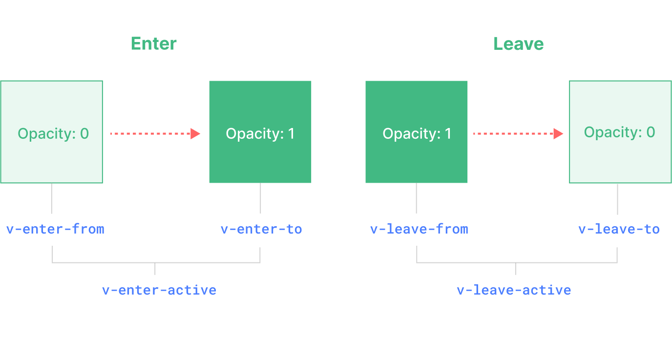
-
v-enter-from: Starting state for enter. Added before the element is inserted, removed one frame after the element is inserted. -
v-enter-active: Active state for enter. Applied during the entire entering phase. Added before the element is inserted, removed when the transition/animation finishes. This class can be used to define the duration, delay and easing curve for the entering transition. -
v-enter-to: Ending state for enter. Added one frame after the element is inserted (at the same time v-enter-from is removed), removed when the transition/animation finishes. -
v-leave-from: Starting state for leave. Added immediately when a leaving transition is triggered, removed after one frame. -
v-leave-active: Active state for leave. Applied during the entire leaving phase. Added immediately when a leaving transition is triggered, removed when the transition/animation finishes. This class can be used to define the duration, delay and easing curve for the leaving transition. -
v-leave-to: Ending state for leave. Added one frame after a leaving transition is triggered (at the same time v-leave-from is removed), removed when the transition/animation finishes.
v-enter-active and v-leave-active give us the ability to specify different easing curves for enter / leave transitions, which you’ll see an example of in the following sections.
Named Transitions
Section titled “Named Transitions”A transition can be named via the name prop:
<Transition name="fade"><!-- ... --></Transition>For a named transition, its transition classes will be prefixed with its name instead of v. For example, the applied class for the above transition will be fade-enter-active instead of v-enter-active. The CSS for the fade transition should look like this:
.fade-enter-active,.fade-leave-active {transition: opacity 0.5s ease;}
.fade-enter-from,.fade-leave-to {opacity: 0;}CSS Transitions
Section titled “CSS Transitions”<Transition> is most commonly used in combination with native CSS transitions, as seen in the basic example above. The transition CSS property is a shorthand that allows us to specify multiple aspects of a transition, including properties that should be animated, duration of the transition, and easing curves.
Here is a more advanced example that transitions multiple properties, with different durations and easing curves for enter and leave:
<button @click="show = !show">Toggle</button> <Transition name="slide-fade"> <p v-if="show">hello</p> </Transition> /*Enter and leave animations can use differentdurations and timing functions.*/.slide-fade-enter-active {transition: all 0.3s ease-out;}
.slide-fade-leave-active {transition: all 0.8s cubic-bezier(1, 0.5, 0.8, 1);}
.slide-fade-enter-from,.slide-fade-leave-to {transform: translateX(20px);opacity: 0;}hello
Try it in the playground
Custom Transition Classes
Section titled “Custom Transition Classes”You can also specify custom transition classes by passing the following props to <Transition>:
enter-from-classenter-active-classenter-to-classleave-from-classleave-active-classleave-to-class
These will override the conventional class names. This is especially useful when you want to combine Vue’s transition system with an existing CSS animation library, such as Animate.css:
<!-- assuming Animate.css is included on the page --><Transitionname="custom-classes"enter-active-class="animate__animated animate__tada"leave-active-class="animate__animated animate__bounceOutRight"><p v-if="show">hello</p></Transition>hello
Try it in the playground
Using Transitions and Animations Together
Section titled “Using Transitions and Animations Together”Vue needs to attach event listeners in order to know when a transition has ended.
It can either be transitionend or animationend, depending on the type of CSS rules applied.
If you are only using one or the other, Vue can automatically detect the correct type.
However, in some cases you may want to have both on the same element,
for example having a CSS animation triggered by Vue, along with a CSS transition effect on hover.
In these cases, you will have to explicitly declare the type you want Vue to care about by passing the type prop, with a value of either animation or transition:
<Transition name="my-transition" type="animation"><!-- ... --></Transition>Nested Transitions and Explicit Transition Durations
Section titled “Nested Transitions and Explicit Transition Durations”Although the transition classes are only applied to the direct child element in <Transition>, you can transition nested elements using nested CSS selectors:
<Transition name="nested"><div v-if="show" class="outer"> <div class="inner"> Hello </div></div></Transition>/* rules that target nested elements */.nested-enter-active .inner,.nested-leave-active .inner {transition: all 0.3s ease-in-out;}
.nested-enter-from .inner,.nested-leave-to .inner {transform: translateX(30px);opacity: 0;}
/* ... other necessary CSS omitted */You can even add a transition delay to the nested element on enter, which creates a staggered enter animation sequence:
/* delay enter of nested element for staggered effect */.nested-enter-active .inner {transition-delay: 0.25s;}However, this creates a small issue. By default, the <Transition> component attempts to automatically figure out when the transition has finished by listening to the first transitionend or animationend event on the root transition element.
With a nested transition, the desired behavior should be waiting until the transitions of all inner elements have finished.
In such cases you can specify an explicit transition duration (in milliseconds) using the duration prop on the <Transition> component. The total duration should match the delay plus transition duration of the inner element:
<Transition :duration="550">...</Transition>At the end you should have something like this:
<button @click="show = !show">Toggle</button><Transition :duration="550" name="nested"> <div v-if="show" class="outer"> <div class="inner"> Hello </div> </div></Transition>.outer, .inner {background: #eee;padding: 30px;min-height: 100px;}
.inner {background: #ccc;}
.nested-enter-active, .nested-leave-active {transition: all 0.3s ease-in-out;}/* delay leave of parent element */.nested-leave-active {transition-delay: 0.25s;}
.nested-enter-from,.nested-leave-to {transform: translateY(30px);opacity: 0;}
/* we can also transition nested elements using nested selectors */.nested-enter-active .inner,.nested-leave-active .inner {transition: all 0.3s ease-in-out;}/* delay enter of nested element */.nested-enter-active .inner {transition-delay: 0.25s;}
.nested-enter-from .inner,.nested-leave-to .inner {transform: translateX(30px);/* Hack around a Chrome 96 bug in handling nested opacity transitions. This is not needed in other browsers or Chrome 99+ where the bug has been fixed.*/opacity: 0.001;}Try it in the Playground
If necessary, you can also specify separate values for enter and leave durations using an object:
<Transition :duration="{ enter: 500, leave: 800 }">...</Transition>Performance Considerations
Section titled “Performance Considerations”You may notice that the animations shown above are mostly using properties like transform and opacity. These properties are efficient to animate because:
-
They do not affect the document layout during the animation, so they do not trigger expensive CSS layout calculation on every animation frame.
-
Most modern browsers can leverage GPU hardware acceleration when animating
transform.
In comparison, properties like height or margin will trigger CSS layout, so they are much more expensive to animate, and should be used with caution.
JavaScript Hooks
Section titled “JavaScript Hooks”You can hook into the transition process with JavaScript by listening to events on the <Transition> component:
<Transition @before-enter="beforeEnter" @enter="enter" @after-enter="afterEnter" @enter-cancelled="enterCancelled" @before-leave="beforeLeave" @leave="leave" @after-leave="afterLeave" @leave-cancelled="leaveCancelled" > <!-- ... --> </Transition> export default {// ...methods: { // called before the element is inserted into the DOM. // use this to set the "enter-from" state of the element onBeforeEnter(el) {},
// called one frame after the element is inserted. // use this to start the animation. onEnter(el, done) { // call the done callback to indicate transition end // optional if used in combination with CSS done() },
// called when the enter transition has finished. onAfterEnter(el) {},
// called when the enter transition is cancelled before completion. onEnterCancelled(el) {},
// called before the leave hook. // Most of the time, you should just use the leave hook. onBeforeLeave(el) {},
// called when the leave transition starts. // use this to start the leaving animation. onLeave(el, done) { // call the done callback to indicate transition end // optional if used in combination with CSS done() },
// called when the leave transition has finished and the // element has been removed from the DOM. onAfterLeave(el) {},
// only available with v-show transitions onLeaveCancelled(el) {}}}These hooks can be used in combination with CSS transitions / animations or on their own.
When using JavaScript-only transitions, it is usually a good idea to add the :css="false" prop. This explicitly tells Vue to skip auto CSS transition detection. Aside from being slightly more performant, this also prevents CSS rules from accidentally interfering with the transition:
<Transition...:css="false">...</Transition>With :css="false", we are also fully responsible for controlling when the transition ends. In this case, the done callbacks are required for the @enter and @leave hooks. Otherwise, the hooks will be called synchronously and the transition will finish immediately.
Here’s a demo using the GSAP library to perform the animations. You can, of course, use any other animation library you want, for example Anime.js or Motion One:
Try it in the Playground
Reusable Transitions
Section titled “Reusable Transitions”Transitions can be reused through Vue’s component system. To create a reusable transition, we can create a component that wraps the <Transition> component and passes down the slot content:
<script>// JavaScript hooks logic...</script>
<template><!-- wrap the built-in Transition component --><Transition name="my-transition" @enter="onEnter" @leave="onLeave"> <slot></slot> <!-- pass down slot content --></Transition></template>
<style>/*Necessary CSS...Note: avoid using <style scoped> here since itdoes not apply to slot content.*/</style>Now MyTransition can be imported and used just like the built-in version:
<MyTransition><div v-if="show">Hello</div></MyTransition>Transition on Appear
Section titled “Transition on Appear”If you also want to apply a transition on the initial render of a node, you can add the appear prop:
<Transition appear>...</Transition>Transition Between Elements
Section titled “Transition Between Elements”In addition to toggling an element with v-if / v-show, you can also transition between two elements using v-if / v-else / v-else-if, as long as we make sure that there is only one element being shown at any given moment:
<Transition><button v-if="docState === 'saved'">Edit</button><button v-else-if="docState === 'edited'">Save</button><button v-else-if="docState === 'editing'">Cancel</button></Transition><style> .btn-container { display: inline-block; position: relative; height: 1em; }
button { position: absolute; }
.slide-up-enter-active, .slide-up-leave-active { transition: all 0.25s ease-out; }
.slide-up-enter-from { opacity: 0; transform: translateY(30px); }
.slide-up-leave-to { opacity: 0; transform: translateY(-30px); } </style>Try it in the Playground
Transition Modes
Section titled “Transition Modes”In the previous example, the entering and leaving elements are animated at the same time, and you had to make them position: absolute to avoid the layout issue when both elements are present in the DOM.
However, in some cases this isn’t an option, or simply isn’t the desired behavior. You may want the leaving element to be animated out first, and for the entering element to only be inserted after the leaving animation has finished. Orchestrating such animations manually would be very complicated - luckily, we can enable this behavior by passing <Transition> a mode prop:
<Transition mode="out-in">...</Transition>Here’s the previous demo with mode="out-in":
<Transition> also supports mode="in-out", although it’s much less frequently used.
Transition Between Components
Section titled “Transition Between Components”<Transition> can also be used around dynamic components:
<Transition name="fade" mode="out-in"><component :is="activeComponent" :key="id"></component></Transition><style>.fade-enter-active,.fade-leave-active { transition: opacity 0.5s ease;}
.fade-enter-from,.fade-leave-to { opacity: 0;}</style>Try it in the Playground
Dynamic Transitions
Section titled “Dynamic Transitions”<Transition> props like name can also be dynamic! It allows us to dynamically apply different transitions based on state change:
<Transition :name="transitionName">...</Transition>This can be useful when you’ve defined CSS transitions / animations using Vue’s transition class conventions and want to switch between them.
You can also apply different behavior in JavaScript transition hooks based on the current state of your component. Finally, the ultimate way of creating dynamic transitions is through reusable transition components that accept props to change the nature of the transition(s) to be used. It may sound cheesy, but the only limit really is your imagination.
Transitions with the Key Attribute
Section titled “Transitions with the Key Attribute”Sometimes you need to force the re-render of a DOM element in order for a transition to occur.
Take this counter component for example:
<script>export default {data() { return { count: 1, interval: null }},mounted() { this.interval = setInterval(() => { this.count++; }, 1000)},beforeDestroy() { clearInterval(this.interval)}}</script>
<template><Transition> <span :key="count">{{ count }}</span></Transition></template>If you had excluded the key attribute, only the text node would be updated and thus no transition would occur. However, with the key attribute in place, Vue knows to create a new span element whenever count changes and thus the Transition component has 2 different elements to transition between.
Try it in the Playground